
I know I’m a little silly, but the first time I walked through our current house, I was excited to see it had a butler’s pantry (I’ve never had one before). And why was I so excited? Because I am my mother’s daughter and love to entertain, which coincides with our slight obsession with heirloom serving pieces. A butler’s pantry is the perfect place to display these pieces so they can still be admired even when the items aren’t in use.
Unfortunately, my excitement waned a bit when I gave the pantry a closer inspection. There wasn’t anything wrong with it. It was just a little dark and sad.
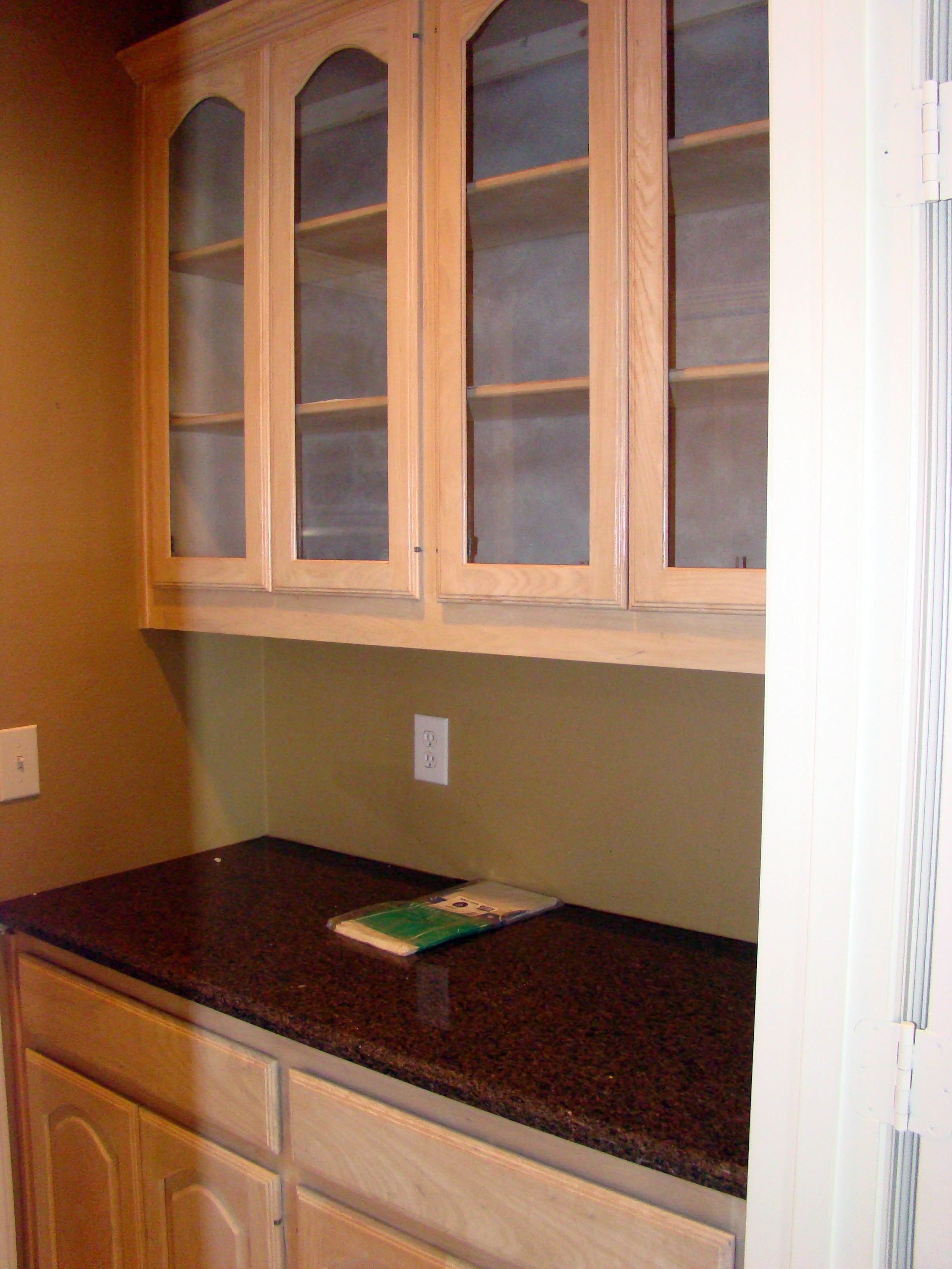
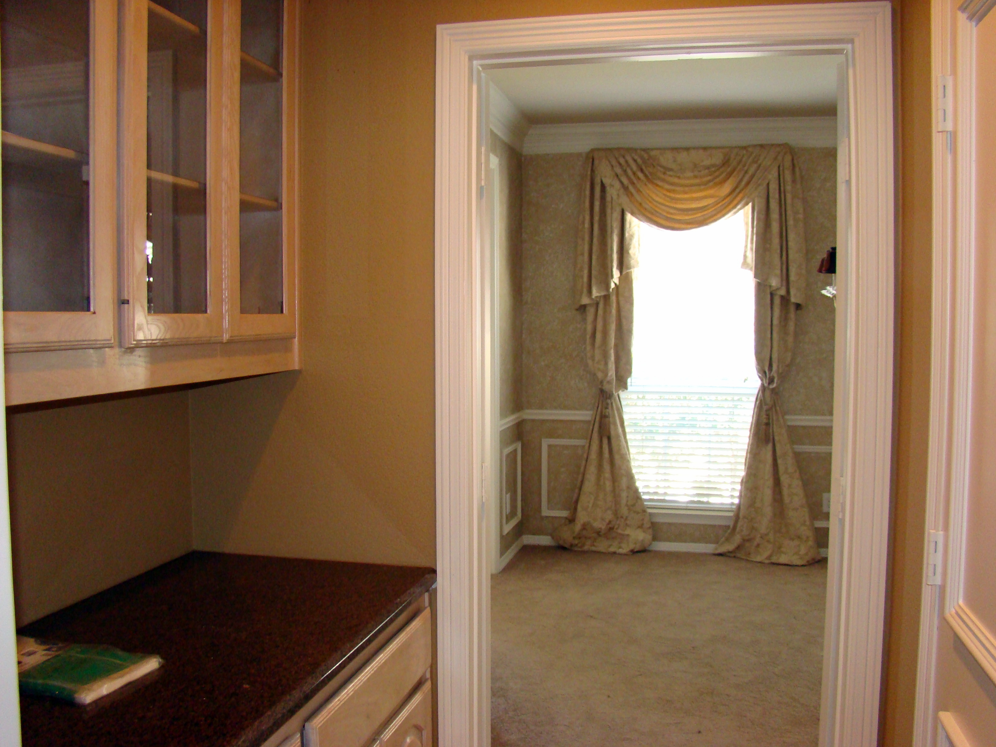
I really wanted to make this space special. I also wanted it to tie in nicely with my adjoining dining room. When we first moved into our house, we had the cabinets in our kitchen and butler’s pantry refaced with traditional white shaker style doors. The old cabinet doors were 16 years old, had a pickled oak finish and were in need of a little TLC. Refacing alone made a huge difference, but the pantry still needed an extra punch. It didn’t help that the interior cabinets were never finished.
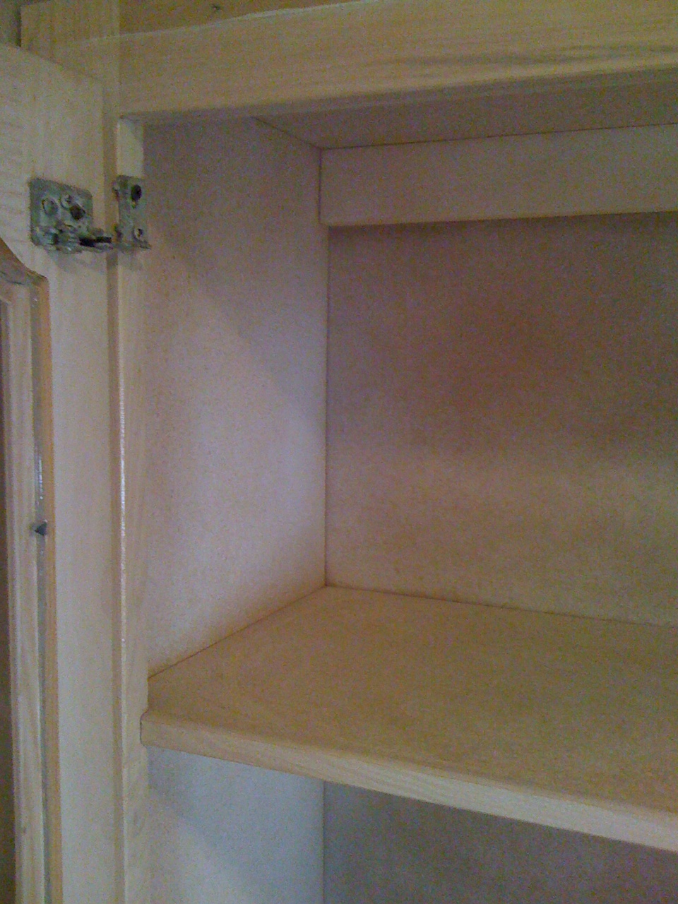
See? It was literally nothing but unfinished, raw materials.
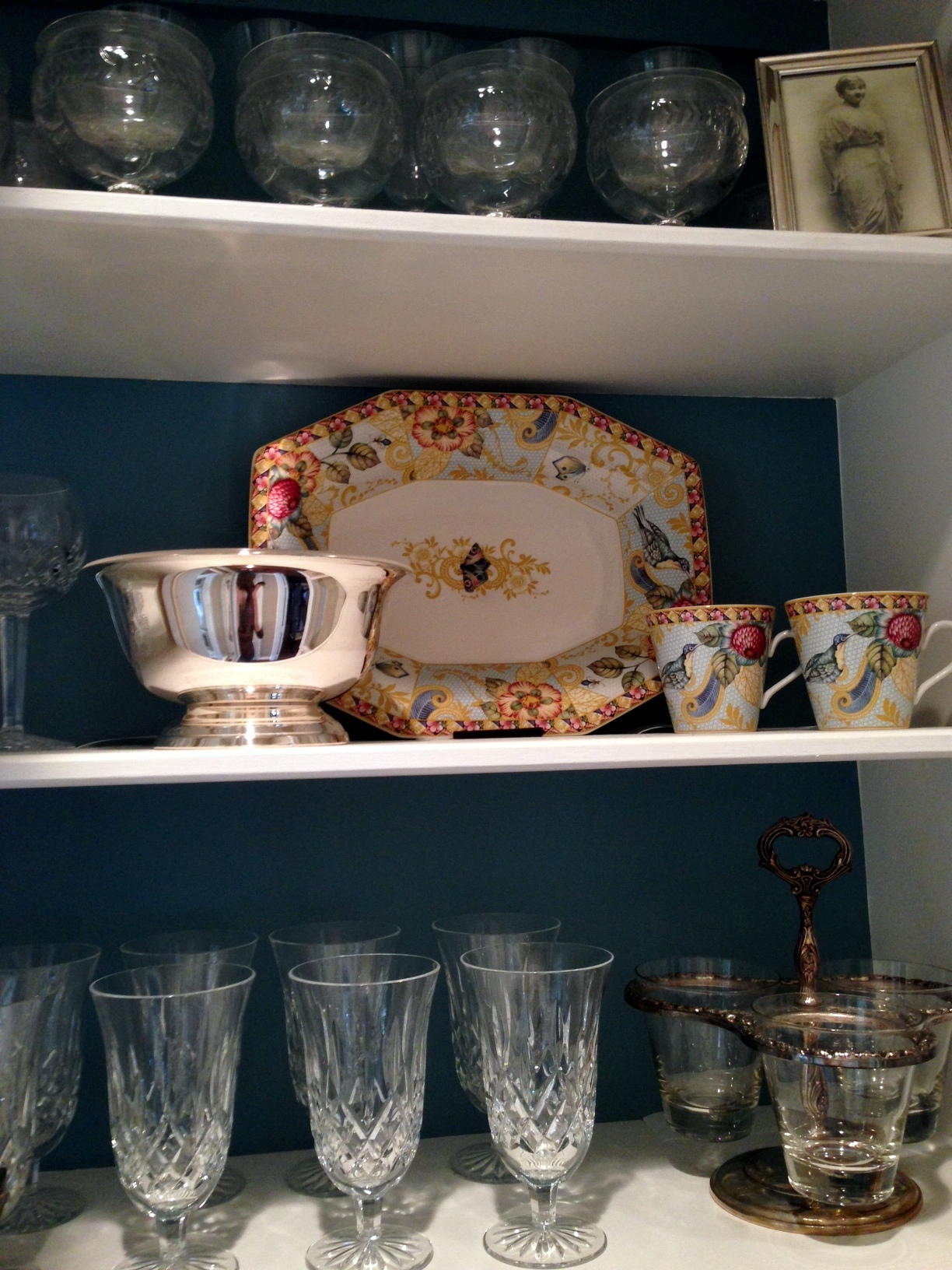
So, into the garage I went to drag out some paint left over from my dining room. In addition to painting the walls in the pantry space the same color as my dining room (Gobi Desert by Behr), I also painted the interior shelves my favorite shade of white (Alabaster by Sherwin Williams). It was looking pretty good, but I knew the pantry still needed something special. That is when I decided to paint the back of shelves the same shade of blue as my dining room ceiling (Mountain Stream by Sherwin Williams). Much better! Not only does the butler’s pantry now blend flawlessly with my adjoining dining room, but the blue paint really helped my serving pieces pop and gave the space a bit more character.
Here are the before and after comparisons…
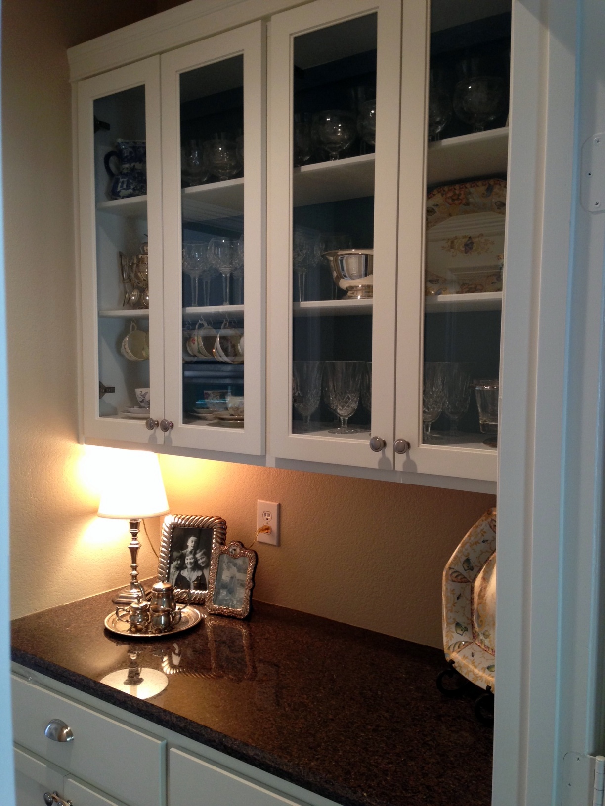

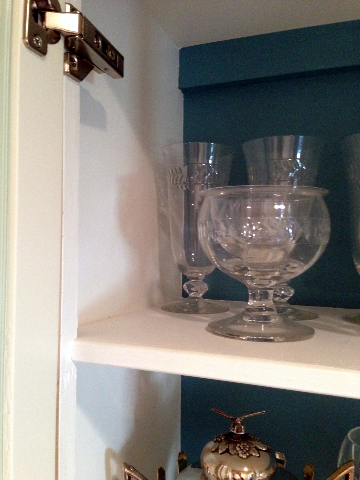
I love how my grandparents’ wedding crystal looks against the blue. The color adds a little contrast to the crystal, which helps highlight the intricate details.
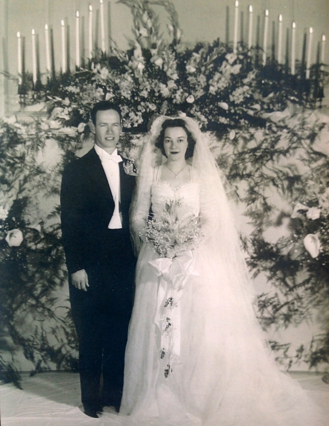
You know me, I couldn’t very well talk about my grandparents’ wedding crystal without showing a picture of them on their wedding day. Aren’t they stunning?
Anyway, here are a few more shots of the finished look (the blue is actually a bit lighter in person)…


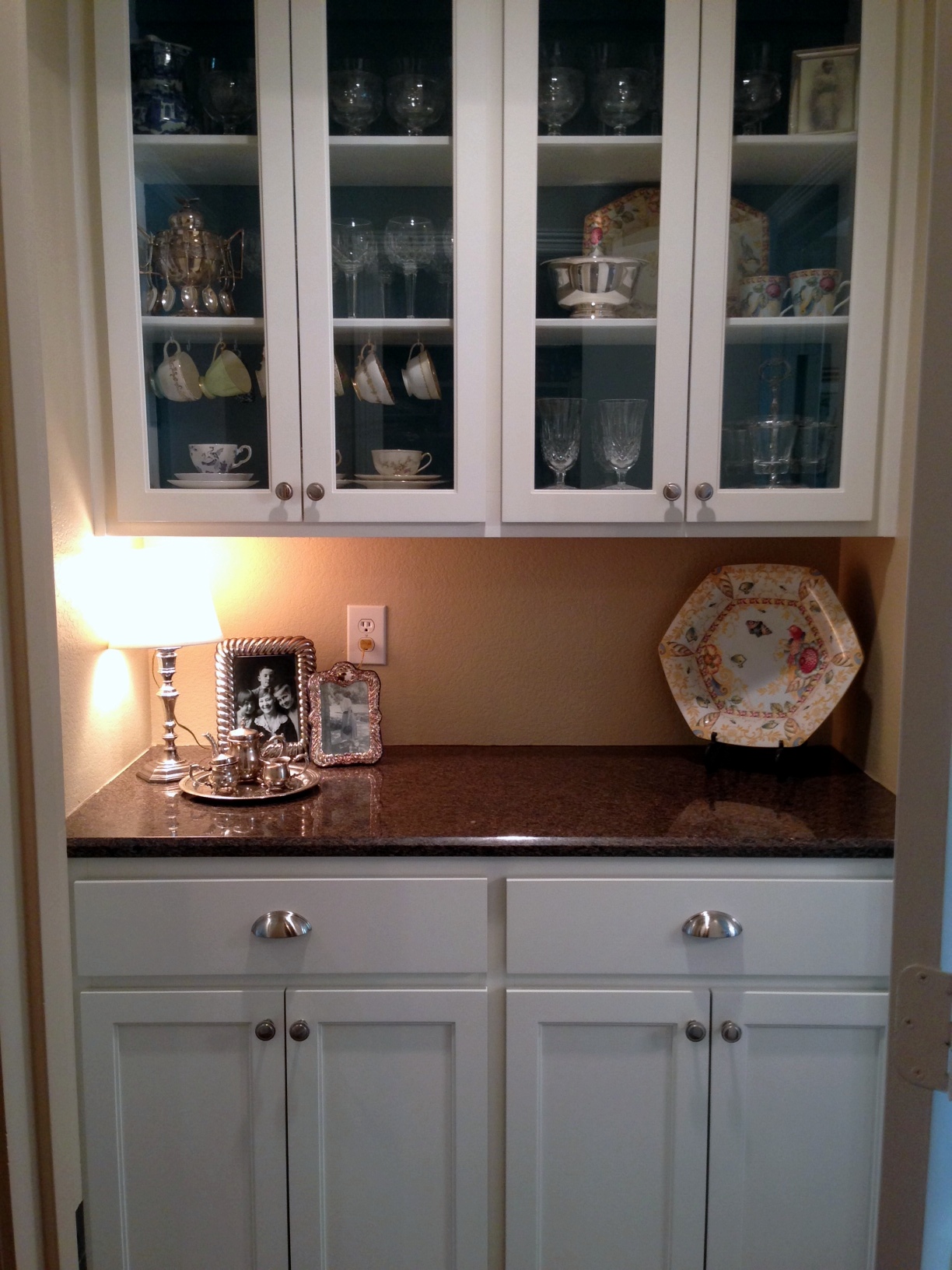

Finally, a space worthy of heirlooms I will one day pass on to my girls. Isn’t it amazing what a little paint can accomplish?

Fabulous!!
Sent from my iPad
I love the strong blue in the back. It really shows off your china and glasses. Cabinets suck to paint, so kudos for not just doing it, but for doing it well.
Cabinets are indeed a drag to paint…especially when you throw an additional color to the mix. I’m typically a laid back person, but luckily(?) I’m Type A when you put a paint brush in my hand. Thanks for the compliments! 🙂